Dalvoy AI
Building an AI-powered exam preparation platform from 0 to 1
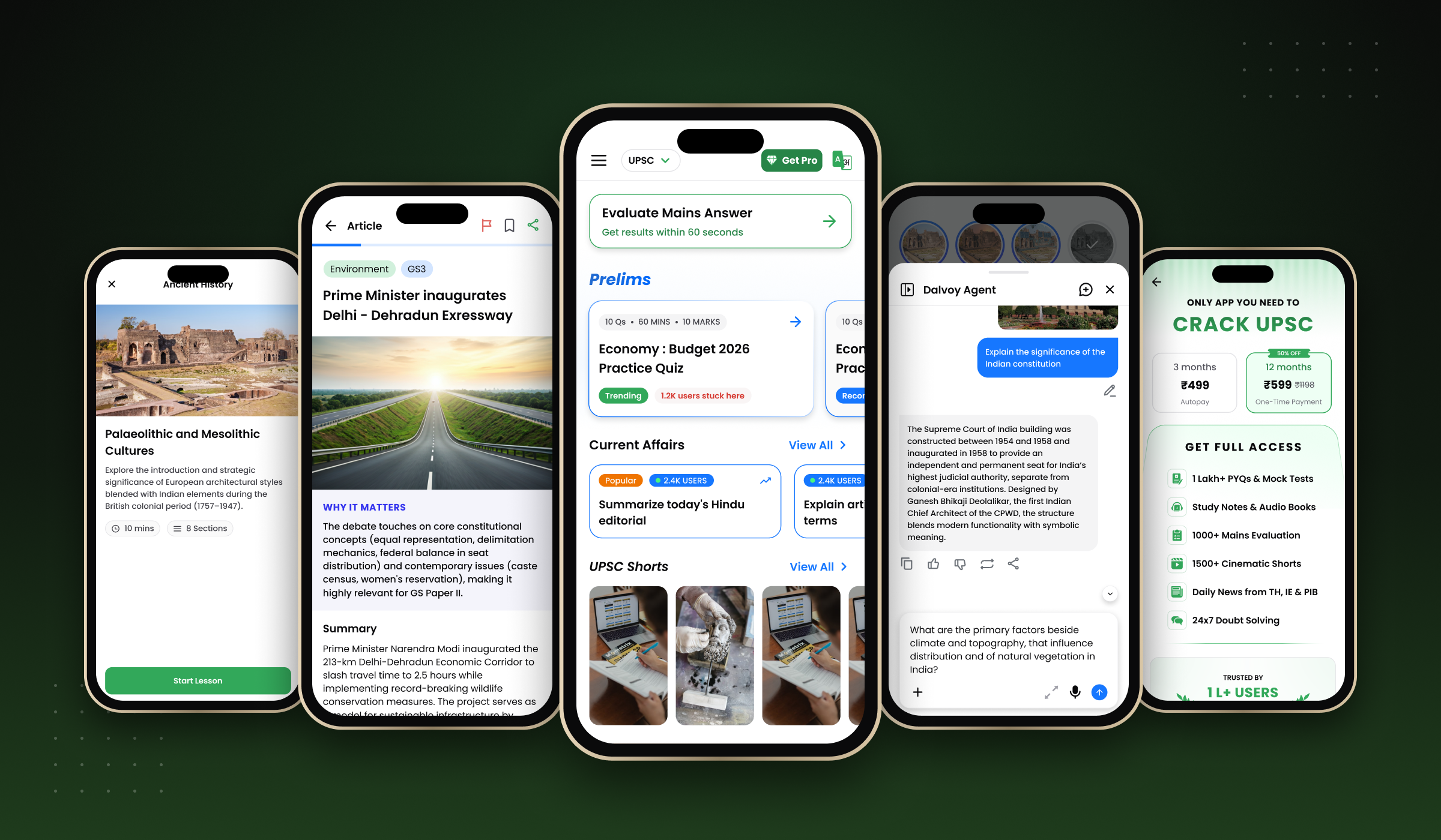
Turning an ambitious product vision into a cohesive learning experience
Preparing for competitive examinations such as UPSC and State PCS requires aspirants to manage several activities: practicing questions, attempting tests, following current affairs, learning through educational content, and evaluating their written answers.
Dalvoy set out to bring these activities together in an AI-powered exam preparation platform.
When I joined, the opportunity was to help shape not just how the product looked, but how it worked as a whole. The team needed a clear product experience that could accommodate multiple learning capabilities, make them accessible to aspirants, and evolve as new features were introduced.
As the sole designer, I worked directly with the founder to translate the product vision and business priorities into product decisions, UX flows, and interfaces. I also collaborated with a small engineering team to take these experiences from definition through design and implementation.
My central responsibility was to turn an evolving product vision into a structured, usable, and scalable product experience.
Designing the whole product, not just individual features
Building an early-stage product presents a different challenge from improving an established one. There is no mature design system to inherit, no settled architecture to rely on, and often no guarantee that requirements will remain unchanged throughout development.
At Dalvoy, I had to work across three interconnected challenges.
01. Defining the product experience
The product covered different learning activities, each with its own requirements and workflows. I needed to define how these capabilities should be structured, how users would navigate between them, and how they would fit into a cohesive platform.
02. Making decisions under constraints
Tight timelines, changing requirements, and limited engineering resources meant that design decisions had to account for both the intended user experience and what the team could realistically deliver.
03. Establishing a foundation for growth
As new features were introduced, the product needed consistent visual and interaction patterns. Without a reusable design foundation, each feature risked becoming a separate design and implementation effort.
These challenges shaped my approach: define the product structure first, design the key workflows, and establish reusable foundations while working closely with the team delivering the product.
One designer across the entire product
I was the sole designer at Dalvoy, working alongside the founder, two frontend developers, and one backend developer.
My responsibilities extended across the product lifecycle.
- Product strategy: Collaborated with the founder to shape product direction and define how the product should approach and serve its users.
- UX architecture: Defined the platform's structure, navigation, and end-to-end user flows.
- Product design: Designed the interfaces and interactions for the platform's key features.
- Design systems: Created the foundational tokens, variables, components, and icons in Figma.
- Engineering collaboration: Worked with the frontend and backend team to translate product decisions and designs into implementable experiences.
The working model was collaborative. The founder and I worked together on product decisions, and I translated those decisions into structured user experiences and designs that the engineering team could build.
This meant continuously connecting product intent with user workflows, interface decisions, and implementation constraints.
Creating structure across a growing set of capabilities
Before individual features could work together as a product, their place within the broader experience needed to be defined.
I worked on the product strategy and UX architecture, determining how the platform's capabilities should be organized and how users would move through the experience from end to end.
The architecture needed to accommodate different types of learning, including active practice, educational content consumption, current affairs, AI-assisted interactions, and performance tracking.
I approached this through three areas of work.
Structuring the platform
Defining the organization of the product's capabilities so users could discover and access the experiences available to them.
Defining end-to-end user flows
Mapping the steps users take through key activities, from starting a practice test to reviewing results, or accessing AI-assisted evaluation and understanding its output.
Connecting features into a coherent experience
Considering how individual features fit within the broader platform instead of treating each one as a standalone destination.
The result was a product experience spanning multiple learning and assessment capabilities, supported by a common UX foundation.
From product decisions to working experiences
With the broader structure in place, I designed experiences across the platform's core features.
Rather than presenting every feature as an isolated deliverable, the following examples illustrate the different types of user interactions the product needed to support.
From question generation to performance review
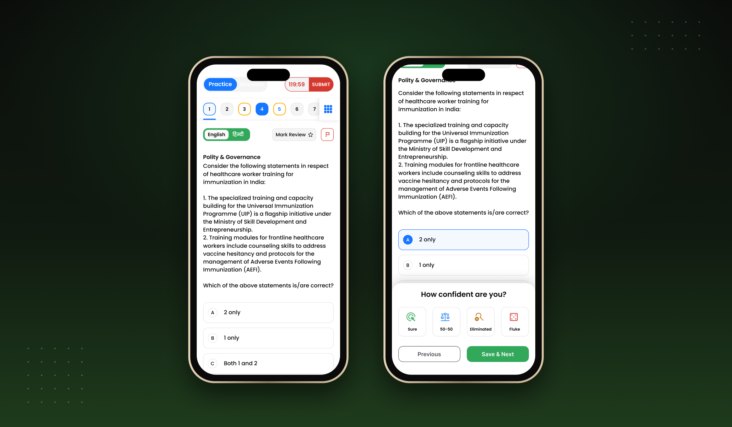
The Practice Test experience allows users to generate and attempt tests, then review their results.
My design scope included the test-generation flow, the test-taking experience, and the results page.
This required designing an end-to-end journey across test initiation, active participation, and post-test review.
- Generate and attempt a practice test.
- Support the test-taking workflow.
- Present the results after completion.
Making written-answer evaluation accessible
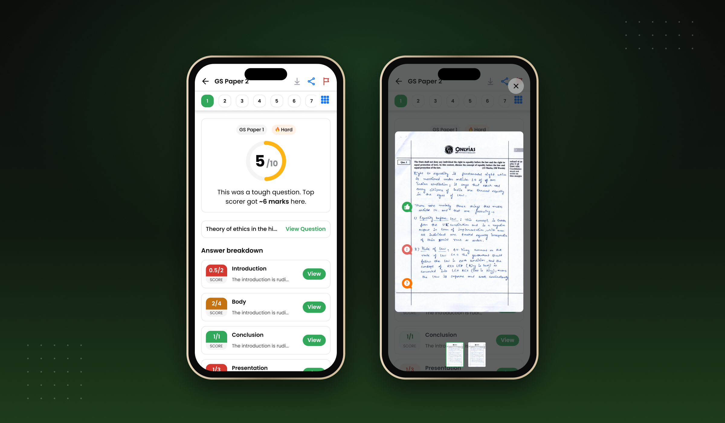
The Mains Evaluator supports a different preparation activity: written-answer practice and AI-assisted evaluation.
My work included the evaluation experience and its results page, connecting the act of practicing an answer with the presentation of its evaluation.
This workflow is particularly important because it involves communicating an AI-assisted outcome in a context where aspirants need to understand the feedback they receive.
- The mains answer evaluation experience.
- The results and feedback presentation.
Supporting different learning behaviors
The platform also included News, Shorts, Learn, an AI chatbot, and a Progress page.
Together, these features expanded the experience beyond test-taking into content discovery, educational consumption, AI-assisted interaction, and progress review.
My role was to design these experiences within the broader platform structure, maintaining a consistent product language across different types of interactions.
Features shipped within the product
- Practice Test: generation, test-taking, and results.
- Mains Evaluator and results page.
- News.
- Shorts.
- Learn.
- AI chatbot.
- Progress page.
Establishing consistency while the product was evolving
As the sole designer working across multiple features, I needed a way to maintain consistency without designing every interface element from scratch.
I created the foundational design system in Figma, including design tokens, variables, reusable components, and icons.
The system provided a shared design foundation for the product and a reference for the frontend team during implementation.
Tokens and variables
Defined reusable design foundations to support consistency across interfaces.
Components
Created reusable interface elements that could be applied across different product experiences.
Icons and visual language
Established a consistent icon set and visual foundation for the platform.
Responsive design
Designed across mobile, tablet, and desktop, accounting for the need to adapt the experience to different screen sizes.
The design system was developed alongside feature design, allowing the foundation and the product to evolve together.
The objective was to support a growing feature set with reusable patterns and a more consistent design language.
Balancing product ambition with delivery realities
Working with a small team meant that product design had to account for the realities of implementation.
The project involved tight timelines, changing requirements, and limited engineering resources. These constraints made it important to maintain close collaboration with the founder and engineering team as the product evolved.
My approach centered on translating product decisions into clear UX and UI specifications while considering the effort required to deliver them.
This was not simply about reducing the scope of design. It was about finding a workable path between the intended experience, changing priorities, and available resources.
A launched product with 500K+ downloads
Dalvoy has surpassed 500,000 downloads, reflecting the scale the product has reached.
During my time at Dalvoy, my design work covered the platform's product architecture, core feature experiences, and foundational design system. The main product and most key features were launched.
These are distinct outcomes: the download figure provides context for the product's reach, while the architecture, shipped features, and design system describe the scope of my contribution.
What I delivered
- End-to-end product design as the sole designer.
- Product strategy and UX architecture in collaboration with the founder.
- UX flows and interface design across the platform.
- Practice Test and Mains Evaluator workflows, including their results experiences.
- Design for News, Shorts, Learn, the AI chatbot, and Progress.
- A Figma design system with tokens, variables, components, and icons.
- Design foundations spanning mobile, tablet, and desktop.
What I want to validate next
To demonstrate the product impact more rigorously, I plan to add Play Store user feedback and any available product analytics.
These can help establish which experiences users value, what problems they encounter, and whether there is evidence of meaningful improvements in usability or engagement.
Product design as a system of decisions
The most important aspect of building Dalvoy was learning to approach the product as a connected system rather than a collection of screens.
Product architecture shaped how features related to one another. Individual UX flows translated those relationships into usable experiences. The design system provided a common foundation for implementation and consistency.
Working as the sole designer also meant taking responsibility for connecting these layers while collaborating with the founder and a small engineering team.
The experience reinforced the importance of making design decisions that account for users, business priorities, technical constraints, and the future direction of the product.
Building a product from 0 to 1 is not just about creating the first version. It is about establishing the structure and design foundations that allow the product to grow.