Selected work, in depth.
Each case is a complete account: the problem, constraints, decisions, trade-offs, and honest reflection on what shipped and what didn't.
Every case. Searchable by domain.
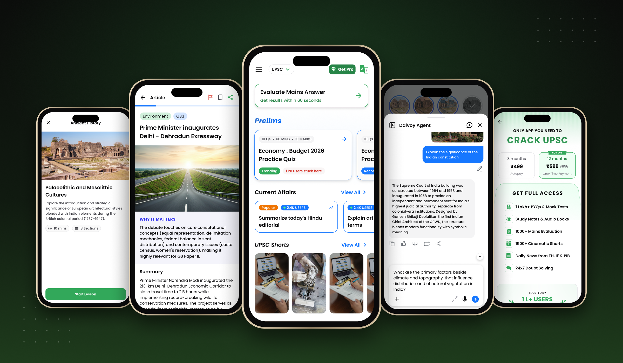
Dalvoy AI: Building an AI-powered exam prep platform from 0 to 1
Building an AI-powered exam preparation platform from 0 to 1 as sole product designer across product strategy, UX architecture, and design systems. 500K+ downloads.
UPI-first checkout: turning India's default payment habit into a 3× conversion lever
Overall checkout converted at ~5%. UPI users converted at 12 to 14%. I rebuilt the flow around UPI as the default: a short product video over the price, and two taps to a paid order.
Result Page redesign: turning the end of a lesson into the start of the next one
The screen every user hits after an exercise was a numeric scorecard ending in “Continue”. I rebuilt it as the engagement-and-monetisation hinge of the lesson loop, shipped as four layered A/B tests.
Gamifying the read-along lesson: a 4-day A/B test that lifted day-zero activation by 2.7 points
Points, streaks and a per-word success animation layered onto a static read-along lesson, run head-to-head against control across four days and ~2K paid users per bucket.
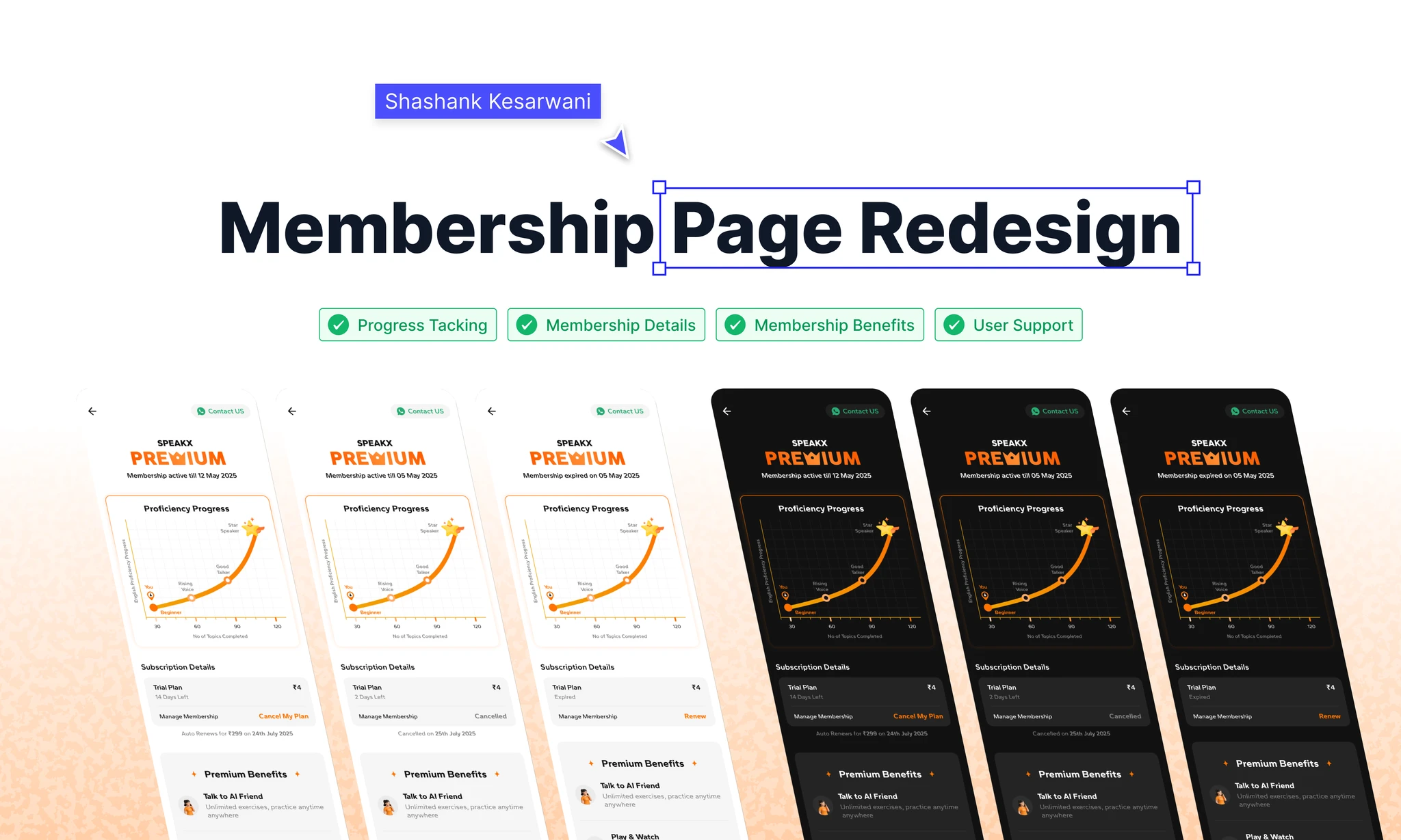
Redesigning the membership page to reduce cancellations at SpeakX
20% of subscribers cancelled on Day 0, and nearly half of trial users were gone by the end of week one. I redesigned the last screen they saw to lead with learning progress, not the cancel button.
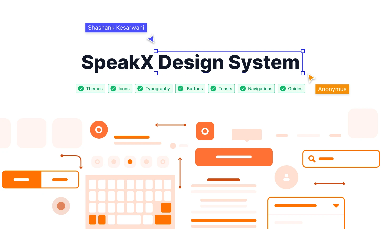
Building a design system from scratch at an EdTech startup
Scattered Sketch files, no tokens, and a dev team re-implementing the same button five different ways. I built the token architecture, component library, governance model and Figma-to-code pipeline over six months while the product kept shipping.